#1 Everything starts with an idea

For years, I’ve had the urge to create an Excel-based solution that I could turn into a product. Platforms like Etsy are packed with Excel templates for everything from wedding planning and personal budgeting to cleaning checklists. But honestly, I always felt those were too small-scale for me. Competing with hundreds of sellers for templates that any decent Excel user could whip up in an afternoon didn’t appeal to me. I wanted to aim higher—something bigger, bolder, and far more ambitious.
Problem needing solving
During my corporate life, I worked in Business Intelligence—or as it was humbly called back there, the "Reporting Department." We primarily relied on legacy reporting tools developed in-house, which were clunky, outdated, and offered only basic functionality.
Then one day, things seemed to improve—we got our hands on Tableau, the leading BI tool in the space. I was like a kid in a candy store, convinced that this tool would finally let me bring the visions in my head to life and craft the beautiful dashboard stories I’d imagined.
But my excitement quickly turned into frustration. Developing anything in Tableau felt painfully slow, and the workflow was clunky—though, to be fair, some of that was probably due to my inexperience with the tool. Still, what really started to grind my gears was how limited it was when it came to customization. For example, creating something as simple as a beautiful doughnut chart required jumping through hoops—and even then, the end result looked terrible.
No matter how hard I tried, I couldn’t recreate the vision I had in my head. Every step of the design process felt like a compromise. And then there was the performance. Since Tableau is a cloud-based platform, the speed sometimes felt unbearable. In some of our dashboards, users would have to wait an eternity for the data to load, completely killing any sense of flow or interactivity.
The worst part? When I looked at the work of some of the top Tableau developers in the world, I realized it wasn’t just me. Even they had to settle for designs constrained by the tool’s limitations and the speed of their dashboards wasn't anything to celebrate about. Tableau simply wasn’t customizable enough to bring my ideas to life, and its reliance on the cloud often made it frustratingly slow.
While Tableau was my first major disappointment, the more I explored other tools like Power BI, the more I realized they weren’t much better—they just came with a slightly different set of features and design flows. Sure, each tool had its strengths, but none of them offered the level of customization and control I was looking for.
Every tool seemed to have its own restrictions, forcing you to adapt your vision to fit their constraints. It wasn’t about mastering the tools; it was about accepting compromises I wasn’t willing to make. That’s when it hit me: if none of these tools could bring my ideas to life, maybe it was time to build something that could.
The first attempt
Back in 2018, I took a six-month sabbatical leave from work. My boss wasn’t thrilled about it—who would be?—but I gave them three months’ notice, and a replacement was found in time. It wasn’t an easy decision, but I was determined to use this time to chase a bigger goal: building my own Excel-based application.
I worked my ass off during those six months. Each day had a strict schedule—exercise, studies, and most importantly, coding. And boy, did I code. By the end of the sabbatical, I had produced over 20,000 lines of VBA code. But halfway through, the reality set in: despite all my efforts, I was barely 5% finished with the gigantic project I had envisioned.
There were plenty of reasons why the project stalled. For one, I simply wasn’t experienced enough back then. My approach to coding was procedural, brute-forcing solutions without much thought to structure or long-term scalability. Sure, I worked hard, but I wasn’t working smart.
That said, it wasn’t a complete waste. I created dozens of useful Class Modules during that time—many of which I still use today—and I learned a ton about the kind of discipline and planning these big projects require. But as for the project itself? It was a failure. A big, humbling failure.
Reawakening the idea
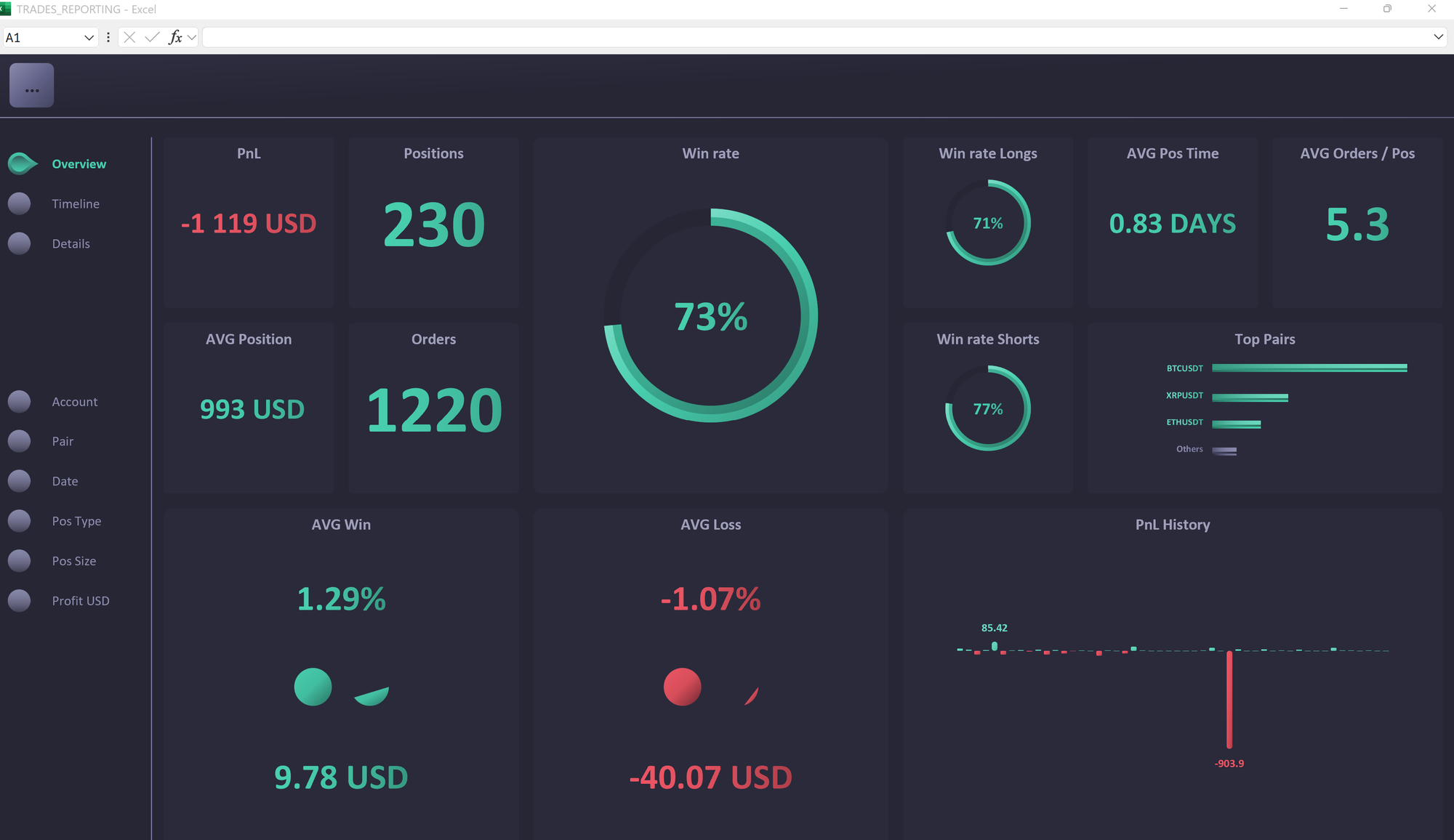
Fast forward to mid-2024. At the time, I was working on a custom dashboard for a Crypto trading bot project—a free favor for a friend. I had compartmentalized much of the functionality, making it scalable, and the results were surprisingly good. It was during this project that the old idea of a Dashboard Builder began to stir in my mind again.
Over the next few weeks, I let the idea marinate. A lot had changed since my first attempt back in 2018. I had spent years honing my skills, tackling increasingly complex projects, and building a much deeper understanding of VBA. By this point, I felt my abilities were finally at the level where something of this magnitude could be feasible. It would still take half of eternity to build it as a solo developer—but only half.
I dove headfirst into researching the current landscape of BI tools. A lot had changed in the market, with new players entering the space and old ones like Tableau and Power BI making incremental improvements. But the same core frustrations that plagued me in the past were still there. These tools still lacked the flexibility, customization, and functionality that I wanted from a dashboarding solution.
I wrote down everything: what these tools did well, what they failed at, and even their pricing models. After weeks of evaluating the competition and envisioning what my tool could bring to the table, I made the decision.
It was time to bring the idea back to life. This time, I was going all in.
The vision
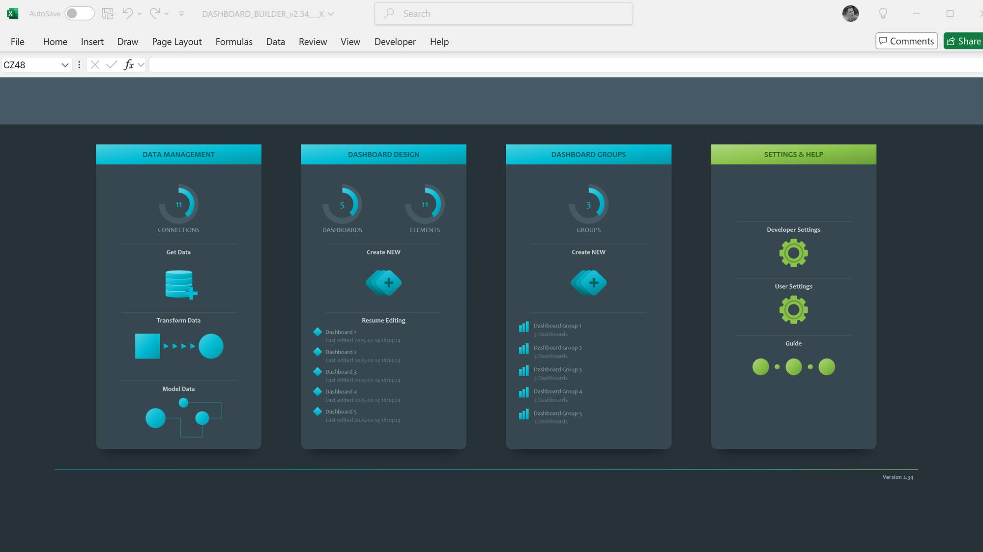
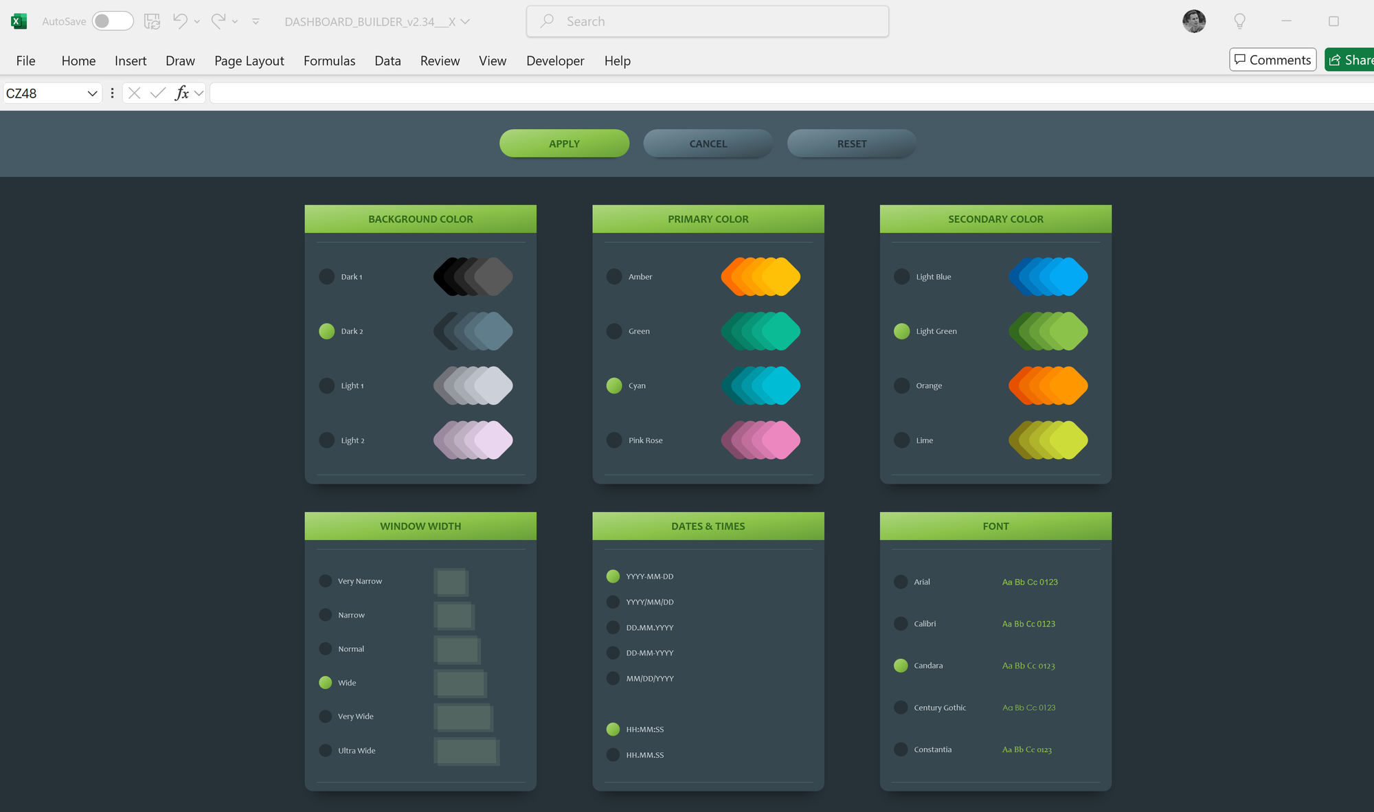
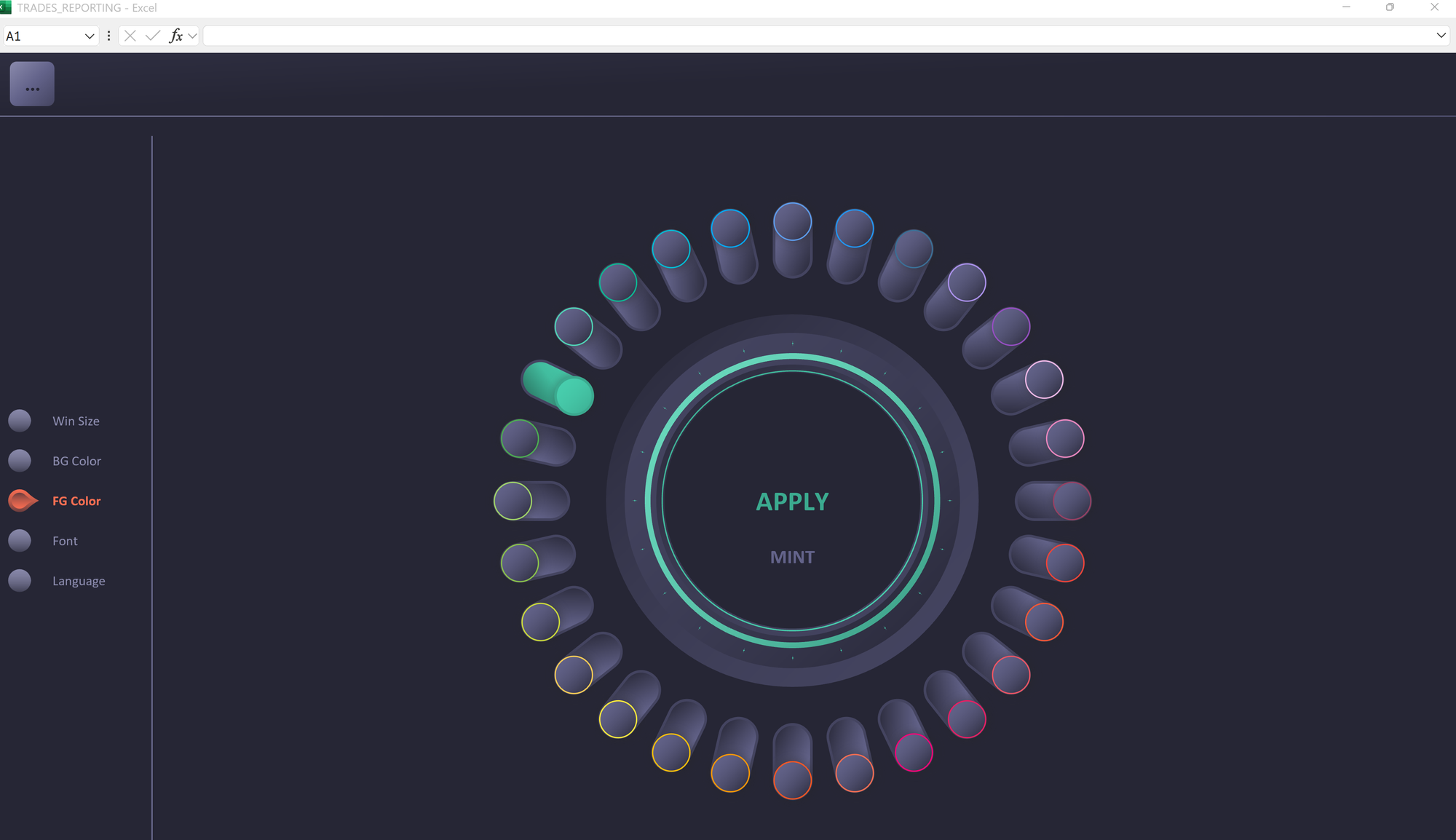
At the heart of ACED BI is a simple yet ambitious vision: to create a tool that empowers users to build dashboards and charts without compromise. There are three key principles guiding this vision:
- Unlimited Customization:
The application needs to allow users to create any kind of graphic or chart they can imagine—no constraints, no predefined templates. You should be able to arrange graphical elements anywhere on the screen, in any configuration you want. Layering, merging, and creating patterns out of graphical components should all be possible, enabling users to link these elements to data and form truly custom charts. If you can imagine it, ACED BI should be able to build it. - Automation and Custom Rules:
Automation should be at the core of the tool. For example, if sales for a given period drop below a certain threshold, the entire dashboard could turn red and display additional analytics. Or, clicking on a specific segment of a doughnut chart could instantly export an Excel workbook with pre-filtered data from that segment. The possibilities for creating dynamic, rule-based dashboards should be endless. - User-Friendly Flow:
Despite its nearly limitless customization capabilities, the application needs to be easy to use. The flow should be intuitive, guiding users seamlessly through the creation process. It should also include smart safeguards to prevent users from making poor design decisions—like selecting a bar chart for a data set with 50 different items. The tool should empower creativity without overwhelming the user.
This vision reflects my frustrations with existing tools and my determination to build something that breaks free of their limitations. ACED BI isn’t just about data visualization—it’s about unleashing creativity, making dashboards smarter, and giving users a tool that works with them, not against them.
Closing marks
This is just the beginning of the journey. The idea is clear, the vision is ambitious, and the plan is in motion—but turning it into reality is a whole different challenge.
In the next post, I’ll dive into how I transitioned from dreaming about ACED BI to actually planning and setting it up: breaking down the features, defining priorities, and tackling the sheer scale of the project. Stay tuned—it’s going to get exciting!